Discovering Maps of Meaning
This graph shows the arcs of desperation vs relief over the course of the Lord of the Rings trilogy:

(Despair is at the top and relief is at the bottom. This graph is also chronological, meaning the books begin on the left and end on the right. The highlighted point can be read to the right - this paragraph is interpreted as the most relieving moment in the trilogy! Lastly, the yellow clouds just represent density.)
And this graph shows the arc between stagnation and the sense of adventure:

(Here points towards the top are more “stagnant” - funnily enough, the highlighted point, the “most stagnant” point in the trilogy, is the meeting with the Ents!)
And this graph shows the degree of superficiality of my writing on twitter over the last ~ decade:
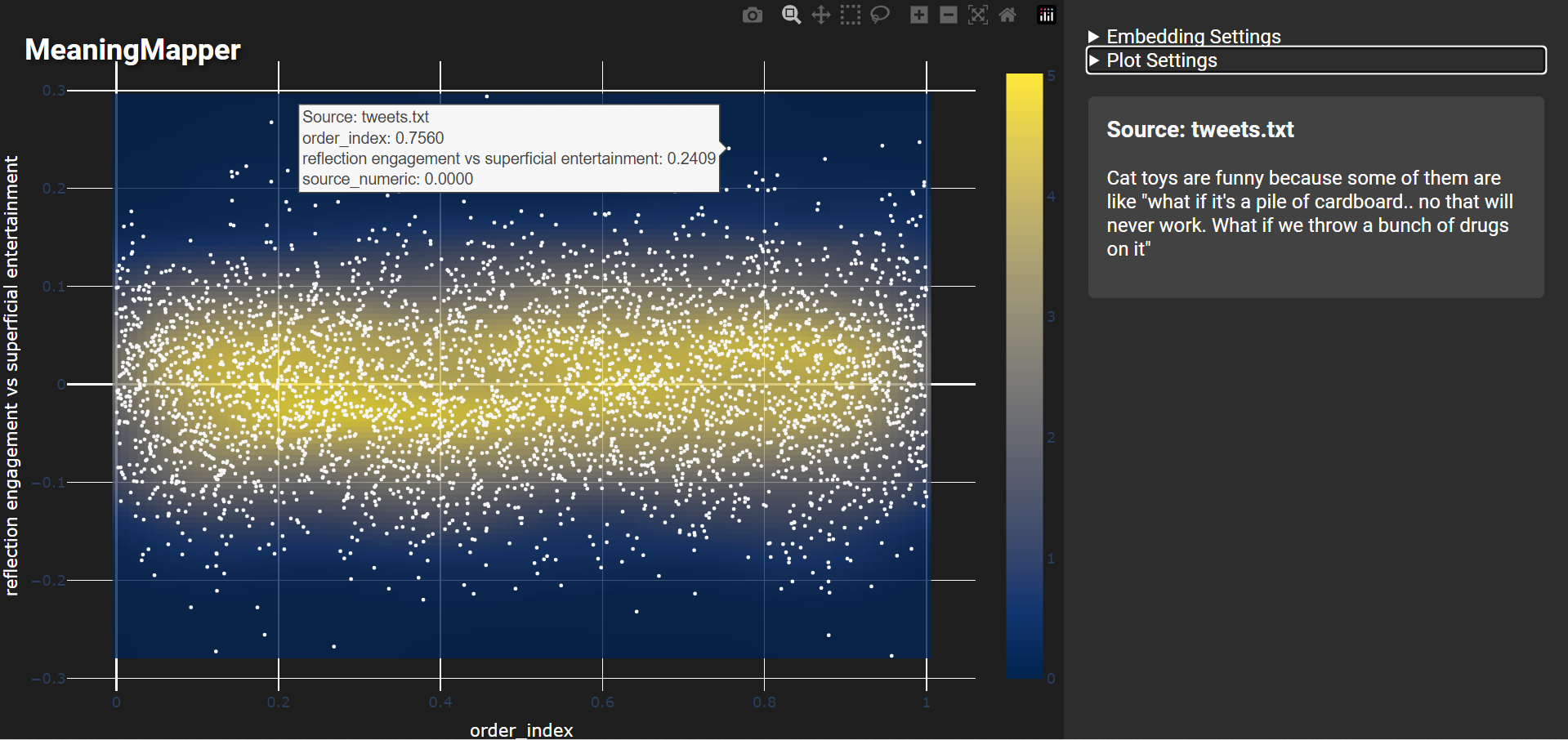
(Here points towards the top are more “superficial”)
And this graph shows how loving they were:
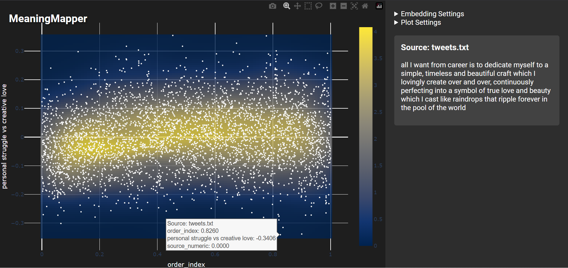
(Again points on the left are older, whereas points towards the top of the graph express more “struggle.”)
This graph shows how I swing between technical and emotional topics, and how my writing has generally shifted over time to be less technical:
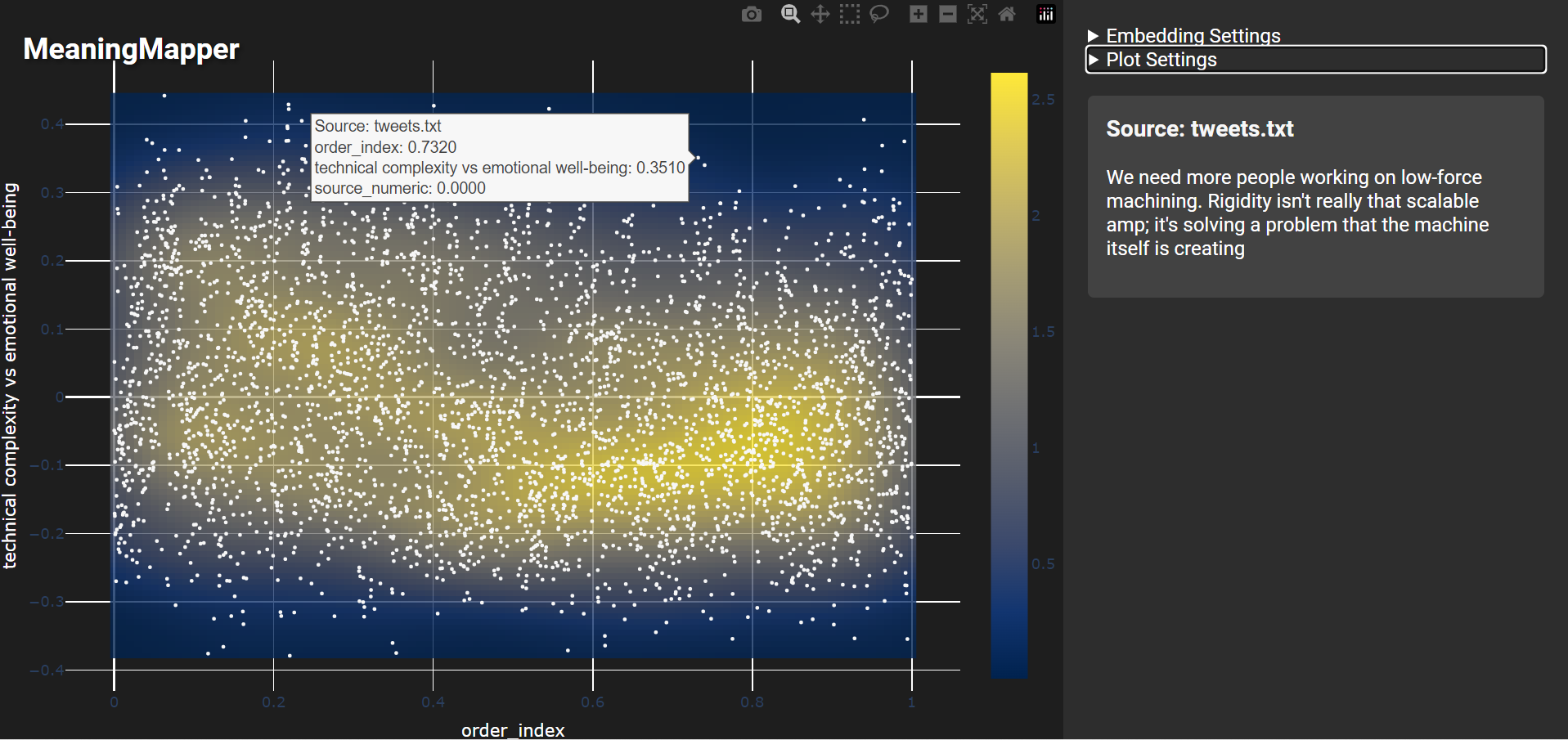
(Here points towards the top are more “technical”)
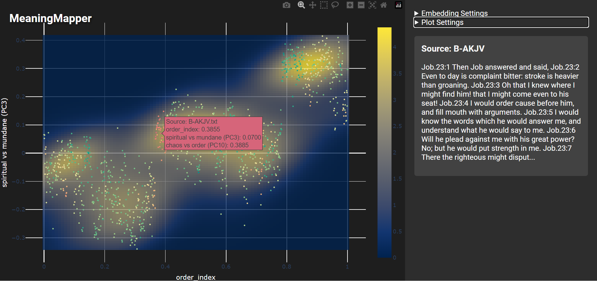
If we analyze spiritual texts like the Bible or the Tao-Te-Ching, we can interpret it along axes like how “Spiritual” vs how “Mundane” the passages are. The Bible is interesting as you can see how different the semantics are between sections:

(Here the vertical axis represents mundanity vs spirituality, with the top of the graph representing the more spiritual. Again, the left of the plot represents the beginning of the Bible. Points are colorized by chaos vs order, where the book of job stands out as particularly “chaotic.”)
Here’s that most chaotic paragraph:
(same as above)
And here we see the Tao Te Ching compared to the Bible - by this measure the Tao Te Ching is considered exceedingly mundane:

(Here the vertical axis represents the spiritual again, and the color represents whether the text is from the Bible vs the TTC)
How does this work?
New Systems for Understanding
AI tools, especially Large Language Models (LLMs), offer the promise of helping us dramatically reduce complexity. LLMs can process vast amounts of information and provide us with simple, concise summaries. An implication of these systems is that LLMs can turn content into numerical representations called "embeddings" that represent the underlying meanings and relationships of text. Think of these embeddings like coordinates on a map: similar concepts are placed near each other, while different ones are further apart. Unlike a flat map that we might hold in our hands with two axes, these embeddings operate on hundreds or even thousands of axes, allowing for incredibly nuanced representations of the semantic landscape.
Embeddings are more than just a technical detail—they represent a fundamental shift in how we engage with information. Embeddings allow us to work abstractly with structures of meaning, rather than exact word-matches or calculations. They increase how quickly we can find and organize information, and how quickly we can learn and solve problems.
Turning Symphonies into Solo-Pieces
So we know that we can turn text data into these sorts of coordinate systems, but turning text into many thousands of random-seeming numbers is not really that useful to us humans — so far we’ve just made things way less readable. The challenge now is bringing these many thousands of numbers into something we can actually understand. One place to start is by compressing the information contained in these numbers. There’s a fast, efficient technique called Principal Component Analysis (PCA), which works a bit like rewriting a symphony piece for just a handful of instruments—you can still capture key patterns and themes of the broader piece, but with far less complexity.
When we apply this distillation technique to embeddings some interesting things happen. We can turn our hundreds of axes into just a ~dozen or so. When we do this we can see ideas and themes cluster together, relationships become visible, and the threads of meaning begin to appear as coherent structures. Clear topics and dichotomies arcs arise. Our new PCA-compressed coordinates maximize “descriptive power” much like how image or audio compression tries to preserve it’s content. When we compress language, we see that the axes on our map represent important conceptual or philosophical differences across the body of text.
But we still have one issue - we might have turned our map of meaning into just a few axes, but we still don’t know what they actually represent — we don’t actually have any sense of what our “X’s” or “Y’s” even are. This has a fun solution - take the most extreme examples (say the top and bottom ten) for each axis, give these opposite sample sets to an AI, and have it describe the difference. In other words, we have some semantic scale that we know describes important differences in our text - we can take the most extreme examples from this unknown axis, give them to an LLM, and say “what’s the difference between these” and that’s how we can find the labels of our axis. When we do this, we see that our coordinate system represents axes like “Tension vs Release” or “Grief vs Joy.” These axes depend on what we’re analyzing — for example spiritual texts are explained by entirely different dimensions like “Belief vs Doubt” or “Destruction vs Salvation” whereas tweets are explained by axes like “frivolity” or “technicality.“
Here’s a gallery of some more examples!


Closing
After experimenting with these systems for a couple years I have some thoughts — I think a few things are likely to happen:
Identifying and organizing complex, abstract concepts will continue to get easier
The accuracy of these systems accelerate along with any advancements to LLM systems
We’ll be able to individually develop clearer understandings of the relationships of complex concepts
Complex concepts and relationships can be mapped out for us, automatically
So to paint a picture of what this might look like - the act of opening hundreds of internet browser tabs of things that interest you could automatically map out a landscape of your interests — their relationships could be identified and visualized and you could use this landscape to understand yourself better. These maps could suggest you things that might interest you next. The books you read or movies you watch can be dynamically compared & contrasted by their themes or narrative arcs. You could visually see how major events in your life changed your personality and the things that interested you.
Systems like this mean that the interplay of cultural spheres and their organizing concepts can be mapped in relation to one-another, with key ideological differentiators between spheres clearly identified. Deeper understandings of social systems and organizational cultures might mean we can more accurately predict the behaviors of organizations or large groups of people. The evolution and interaction of more central, organizing beliefs in groups can be more easily mapped over time, and the impact of major historical events on a society could be visualized and interpreted.
In many ways all of these are already happening - algorithmic systems model our habits and interests to suggest us social media posts, music, search results, and videos. We model engagement history and the frequency of words and topics in different spheres. The important thing to realize is that these systems have already been colossal organizing forces on our lives and societies, and any improvement in their depth and explanatory power means sweeping, foundational changes to our lives and cultures. Corporations use these systems to understand and influence our behavior, but I think we can also use these systems for self-discovery, expression, and for organizing our thoughts and lives.
As AI systems begin to understand on a deeper level not just what we value and think about, but how these concepts all intertwine and influence one-another, there’s tremendous opportunity and tremendous risk. AI systems are steadily integrating into every system we use on a regular basis. This comes with many individual opportunities and also implies vulnerabilities. I think one way to increase our resilience against the latter is to build tools for the former, where we increase our ability to interpret and synthesize the complexity of our lives and influences, making us less susceptible to algorithmic architectures of influence or control. I think if we can more clearly see what is happening in information landscapes, we can navigate them in more intentional and humane ways.
Thanks for reading! If you’d like to support me in my research or creative work consider ordering something from my shop or commissioning one of my services!